supertrooper
-
Posts
142 -
Joined
-
Last visited
Content Type
Profiles
Forums
Calendar
Everything posted by supertrooper
-
google it?
-
I actually contemplated that.
-
True. I can't take credit for the logo anyway. I just did a google image search for Orion and there was a place called The Orion Labs...I took their logo, removed two stars and added a gradient. I didn't feel like putting that much effort into creating a logo of my own.
-
Look what I just found! Just kidding, I made it. But I wouldn't be surprised it we see something similar.

-
Because they were mistakes with no hidden meaning.
-
Yeah, but Mike's a jerk.
-
But it's not the end of the world. Just the world "as we know it". New technology and space travel is "A Whole New Wooooorld"! Don't you dare close your eyes.....
-
You're giving them way too much credit. I work in the printing and design industry...incorrect files go out all of the time unfortunately, and the brands I work on are national brands (Hershey, P&G, Kimberly-Clark, Pepsi, etc.). Usually the mistake is caught by the client before printing, but sometimes it actually goes to print. The people working on these posters were probably more concerned about them looking good and ended up making copy errors...either by typesetting the copy incorrectly or copying and pasting from the wrong source. The quality assurance and proofreading at the sign shop is apparently not that great. The first two posters were replaced completely most likely because they were the wrong set of prints and they were only out there for such a short period of time before it was noticed. The other one was taped over because it had the wrong ridership numbers, which was pointed out here. I've already noticed other issues which I mentioned in a previous post (font usage and punctuation inconsistencies, the verbiage missing on Invertigo's poster, etc). They made mistakes...consistently.
-
It's actually much easier and more cost efficient to print out a portion of the artwork on a piece of 8.5"x11" adhesive backed paper and then trim it down than it is to reprint the entire thing to make a correction. I think everyone if reading too much into shoddy design work and posters going out with mistakes on them.
-
I'm not sure they'd want to bring up Flight Commander. There would be kids asking their parents what it was..."Oh, it was a ride that flipped you upside down and if you were drunk enough and passed out you'd fall out and die".
-

Does the Banshee rattle bother you?
supertrooper replied to ThrillKingsFitzy's topic in Kings Island
There's nothing wrong with the title, unlike your post. -
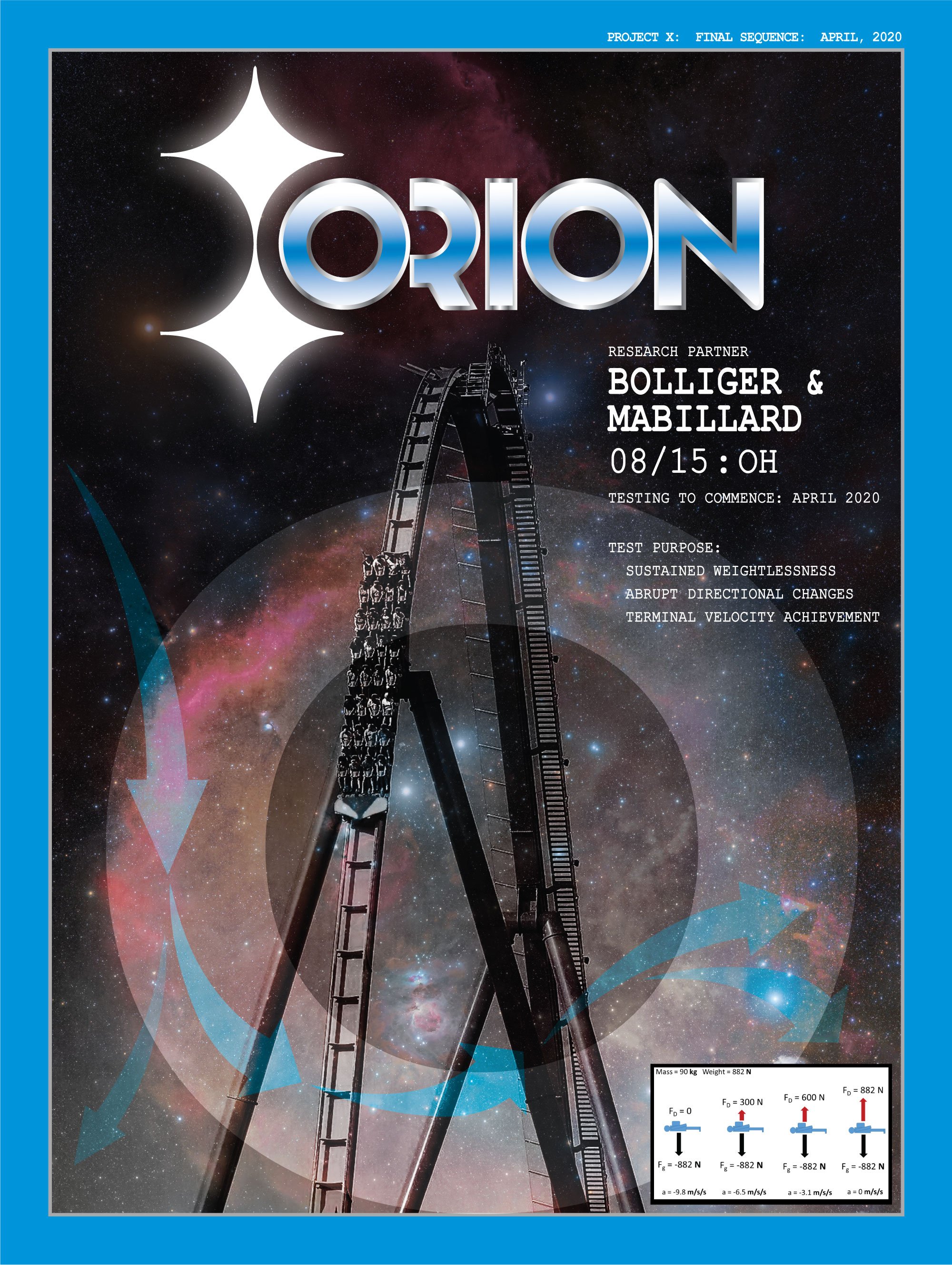
I think they are basically using KIC as their proofreaders. Someone pointed out yesterday that the FOF ridership numbers and the Firehawk ridership numbers were only a difference of 1000. Now that number has changed. It seems like their design department doesn't really have much of a quality assurance department.
-
The inconsistency in the design of these posters bothers me...but that's probably only because I do production art and quality assurance for a living, so I'm always looking for mistakes. It probably hinders my ability to enjoy things, but I can't help it. For instance: the Invertigo poster does not have the "Research Partner" verbiage above the manufacturer that the other two have. The Firehawk poster uses a different font and also has colons after "Tests Administered" and "Test Purpose", while the other two don't. I would have marked these up and sent them back to the designer before printing.
-
I think that K and I are the initials for Kings Island and perhaps they won't spell anything out.
-
It was probably as simple as whoever put them up grabbed the wrong ones. I work in the graphics and design industry...small revisions are made by design directors all the time, even after printing, so the first set may have been a "Round 1" design that hadn't been thrown out yet. As far as the letters on the sign...maybe they are just the initials for Kings Island and not really going to spell it out.
-
Although Dolly herself is very accepting and open minded, I don't know if the majority of clientele at Dollywood is ready for trans.
-
No, SeaWorld San Diego. Orlando already has a Mako.
-
After watching the various videos of interpretations of the blueprints, I thought I’d be more excited about the coaster’s potential. I’m not. The videos are well done and look realistic, but it just ends so abruptly. And I keep hearing “but Fury kind of fizzles out toward the end”. Well then, fix that...don’t end it like Fury. Add some low to the ground s turns (like El Toro or Lightning Run) and speed hills after the helix. Also: it’s spelled “queue”. “Que” is Spanish for “what”.
-
I didn’t see it either. Is that an actual maneuver? It sounds like what the woman in front of me at Starbucks ordered this morning.
-
Where is there an outer banked turn on The Voyage?
-
https://imgur.com/gallery/evgVSOa These were posted by parkfans.net and are pretty good.
-
It's not that close and it's not that busy.
-
Tallest and fastest coaster at Kings Island.