brenthodge
-
Posts
1,421 -
Joined
-
Last visited
-
Days Won
46
Content Type
Profiles
Forums
Events
Everything posted by brenthodge
-
Oh, I agree that those were build up years to the peak of 2022. I get it was the 50th, and I don’t think anyone expected 15 minutes of fireworks every night the next year, but there were operational and strategic decisions being made that seemed to be setting the park up for long-term success and greatly enhanced guest experience. Those decisions, sadly have either been reversed, or so undermined by new objectives and strategies that it feels like nothing was learned from that time. I’m honestly surprised the darn dog show hasnt returned yet.
-
2021-22 was truly a new “Golden Age” for the park. It felt “right” for the first time in a long time. I have to believe it also showed in revenue numbers. The problem with corporate structures though is, the highs have to carry the lows. That was a pretty dismal year for other parks in the portfolio, and unfortunately anything we “banked” was spread thinned to cover for others losses.
-
Black Forrest Trifle totally not worth the price. I didn't event realize it was that much till I tried to figure out what the heck I bought last night that showed up on my card statement as $10.13.
-
I don’t know if we’ve taken the brunt of it. If so, it’s only because we got the lions share of good. Dominion’s CARNIVALE is dark on Wednesday nights (and was on Tuesdays last year) Carrowinds 50th was hollow compared to ours just one year prior (rehashed logo, reused parade parts without the actual fun of a parade, fireworks that reused a theme song from a ride that was never there, minimal live entertainment (and still next to none) . I think we got a great lucky run of: Initial concept event CARNIVALE that was essentially designed for the “International street parks”, followed up with a CARNIVALE (and season in general) that rode the “post Covid” wave of pent-up visits and spending. That funded an amazing 50th that got all of the budget that had been allocated for it, then the poop hit the fan. I’m impressed we’ve been able to hold onto what we have, but so many of these things I’m talking about could’ve been solved more more long-vision planning. I guess when the money is flowing, you assume it always will, then when the cuts come, it’s harder to “fake it”
-
I agree to some extent, but there still seems to be some leeway just based on variances you see from park to park doing the same event. I neither blame the solely or excuse them completely.
-
That’s why sites like KISeasonPassholders that copy paste anything the park tells them to, or gush about how “amazingly, fabulous, wonderfully, specially, amazingly wonderful” everything is don’t help. There’s little room for actual dialogue about how things might not be as rosy as they paint. I’m all for having a good time regardless, but I refuse to go on and on about how AWESOME this event is when it simply isn’t anymore. It’s fun… it’s ok… it doesn’t cost me anything extra and that’s about what I’d spend on it now. Flashback to 2019 when I didn’t even have a pass and bought 3 after 5 tickets and 2 tasting cards and went 2x. Once alone and once as a date night with my wife. Felt like I could’ve gone a third time to catch all the local entertainment, tried 2-3 more things that sounded tasty and seem the parade one last time. THATS what you aim for with events like this, not “let’s provide the bare minimum to the people who already paid to come and eat to hopefully milk them for at least another few dollars.” I’d be embarrassed to bring anyone to this “cultural food festival” as it stands now.
-
OK - Made it over last night and... Its a mixed bag for sure. Better than last year, way worse than first, reflects the new reality that I think we are living in. 1) The idea that this is a "cultural festival" left the building after year one when the mini-stages with authentic entertainment and country-related crafts never returned. It's definitely a "cultural appropriation and stereotype fest". Honestly the longer this runs, the more culturally insensitive I think it feels. Maybe its time to either return some authenticity to it, or just make it "Summer Party-Gras" 2) There's really nothing to do after the "opening" and before the parade (see above items that got cut) outside of one craft tent and the scavenger hunt. Really wish there was more entertainment options to make it feel more "alive". Even if this went to weekends only to make it stronger... I'd be all for it. 3) The lack of food tents affects the feeling of a true festival. Most all of the food has moved to "relevant" permanent food service locations and seems to be just sort of mixed in with the regular stuff. Why they didn't just go ahead and use Grill and Grain for Spain and not even bother with that tent, or move China there since half of the G&G grain menu has already gone Asian - maybe add India back in. I don't know... people seemed to be snapping up LaRosas WAY more that Lasagne Frita or Canolis. The lack of tasting cards makes sense now as I honestly think they are ok with reduced sales on these items, as moving them into the regular service line cuts down on payroll which probably makes up for the loss of revenue. Also the kitchen staff would be stretched if they were cranking out high volume of these things - heck a triffle at "Germany" took close to 10 minutes with only one person in front of me. They have cut so much of support staff, that I don't think the volume that tasting cards drives could be supported, and the "food festival feel" is gone without tents or temporary structures everywhere to taste at. I certainly didnt see a lot of tastings on people's plates. To me, I only do desert as thats what I can't get on meal plan since the cards went away. 4) Parade looks great... until the end. FOT THE LOVE OF GOD can they not figure out a good way to end this thing that isn't a traffic nightmare. I threw out a suggestion in the parade thread of a way to end it around the tower so the cast could just organically go to the closing show, some of the floats could stay, and a few others "sneak back" right before the fireworks. This could add to the overall festival feel. 5) Speaking of closing show and fireworks, the ending is... ok. But I REALLY miss the first few iterations where the show just flowed right into the fireworks. I thought with the later parade time they were doing that this year, but it just ended, the stage went dark and quiet, the cast all left and a few minutes later the regular closing show started. We have GREAT infrastructure now - way more that we ever had in 2019. Craft a CARNIVALE exclusive closing that can be used every year, but only runs 2 weeks during the event. Maybe another original song. Drones make flags of different countries as lyrics are sung in that language - cultural landmarks in drones bring France, China and Italy to life. Bandstand cast close with live version of the chorus. The way it is now is just clunky and kills any momentum they had going. I used to want to never leave when it was the big dance party, now I had to convince my kid to stay another 15 minutes for fireworks. It really feels like - as much as I hate to say it - this has run its course. Maybe I've just been there too much, but so have a lot of us. SO MAKE IT BETTER EACH YEAR!! There are so many things that could be done to build on the energy that 2019 started, but instead its been a slow drain. Some things - like permanent festival stages or food/beverage locations that could've been built and adapted for other festivals - required long-term planning that just doesn't seem to be there for this. Long-term solutions for getting a parade to make a full circuit in a timely manner so cast can get to next mark that needed infrastructure reworked were never acted on. Decor and seating seems to have been cut back, but doesn't seem to be missed as most people seem to just wander through and reconvene for the parade. I really WANT to want to go back another time or two (or three) like I did in 2019 and 2021, but I just don't really care to make a trip just for this over the next week.
-
That adds 10000 times more maintenance, so…. Yeah you do the math. You’d have lit costumes (maybe 1/2of them if lucky) only the first night. There’s a reason PaintTheNight still sits in storage at Disneyland. Lighting tech on costumes with tons of movement synched to gloats is VERY expensive to maintain.
-
I’ve got a whole lot of thoughts coming out of my visit last night. Will post review/wish list later today.
-
That mass exodus already happens. Just now with a whole lot of chaos.
-
Again?? Thought maybe they had the ending figured out so it wasn’t the chaos it usually is- but no. Parade ends, floats stay parked, performs leave, people realize it’s done, then they start to leave, floats try to drive home empty, escorts just keep yelling “behind the white line” but the parade is not moving against the flow of people trying to leave. It’s just a mess. I get that performers have to get to the next assignment, but this just isn’t working (but I guess it’s been a mess since 2019, so they are ok with it?? I love that the cast assembles on stage to have a “closing”, so why not shift the last show stop to the tower? Run the parade the “old” route down the Starbucks side, shift the show stop to wrap around the base of I street from Starbucks to Build a Bear. It would give more space in the open plaza area for the stop, make more sense to have the area have one stop, allow for a better show (you’d see all of IStreet and once, could even add a finale of rooftop low level pyro). Then go up the LaRosa side, around the tower for the last show stop. Parade ends. Performers just go right to stage, floats stay for few. If there’s not room for the floats to stay there for the remainder of the evening, the first float circles to park on the French corner side, the second moves to park on the other side, and the remaining follow the path home.
-
Snoopy's Soap Box Racers & Camp Snoopy Reviews
brenthodge replied to KIghostguy's topic in Kings Island
On a different (related) note: I know I beat the park up a lot (only because I see so. Much. Potential that it frustrates me at times when they get so close and stop) But did chat with Koontz tonight when I bumped into him at Beagle Scout Acres as my 9 year old was running around (for like the 10th time). Told him I rolled my eyes last year when I saw this area was the big addition?!!? But as proven by my kid running around - Playing tag with kids he’s never met, laughing and begging to stay even though Orion only has a 15 min wait??? They’ve tapped into something very needed. A place where kids can just be kids and play. He smiled and said, “thanks. I need to hear that” I think the bad often outweighs the good they hear, so make sure you balance the narrative any way you can. -
Snoopy's Soap Box Racers & Camp Snoopy Reviews
brenthodge replied to KIghostguy's topic in Kings Island
Picnic table quality in Beagles Scout Acres greatly reduced. Only on top of hill now. Only 2. Might be their way of cutting down on food spills. BENCHES folks. Just benches. Snoopy seems to now be officially dead on SoapBox. No movement still. -
I was like… Whasaaaat? What international tasting did HE eat last night that made him go cra??
-
You shouldn’t need to “check the Ap” when I believe she was posting in response to them bragging they published a GUIDE that you had to click 2-3 things to get to, only to realize it 1) had a blank space for a map and 2) told you nothing in a guiding way like times or prices. The incompetence is becoming staggering. You have to wonder does Senior leadership like Koontz not see it, is he powerless to do anything to change it, or does he just choose to not?
-
Someone in that department isn’t really doing his…I mean THEIR job. Not a single blog post or social post about “The amazing job the décor team does to create great settings” no, “Did you know that sone of the floats were designed right here in Cincinnati, and others from an ACTUAL Mandi-Gras float company in New Orleans” I know those were stories the first year or two, but there are new markets and new people to connect with. There were no fresh stories, no local ties, no fact checking to see if the event details are even correct.
-
I think that’s going to be a lot of people.
-
I 100% feel like they are intentionally trying to sabotage this aspect of the event. I honestly don’t see any financial “win” to doing it the way they are. With different amounts that have to be added up, and they are even intentionally taking on more credit card processing fees by making people make multiple purchases. If anything, I’d see them moving toward making it almost mandatory that you HAVE to have a one-time purchase (preferably on line with a slight discount) global tasting passport. You don’t think you’ll buy one in advance, then you get up the event and see how EASY it is to taste 5-10 AMAZING good items, so you go to one of the 2-3 locations and buy one on site with a “premium” price.
-
Snoopy's Soap Box Racers & Camp Snoopy Reviews
brenthodge replied to KIghostguy's topic in Kings Island
Still no flag. Still no movement. You’d think since they cut so much detail out of this project, they could keep the 1-2 things they DID do actually working. -
How easy it would’ve been to “no thought” try different things with simply the scan of a card dangling from a lanyard around my neck. Off to Dollywood to see how a real food festival is run! (Or heck, even Anakeesta where you can get adult beverages on your “tasting card” I honestly don’t see me pulling out my wallet for any of this with the dining plan.
-
Kings Island 2024 Food Reviews and Discussion
brenthodge replied to SmartCat7162's topic in Kings Island
This is the thing I don’t understand why they can’t master. I applaud they tried to actually “plate” the meal, but what they used looked like the lid to a takeout container. -
Whew. Looks like the white out has cleared up. Thought it was WINTERFest for a while LOL

-
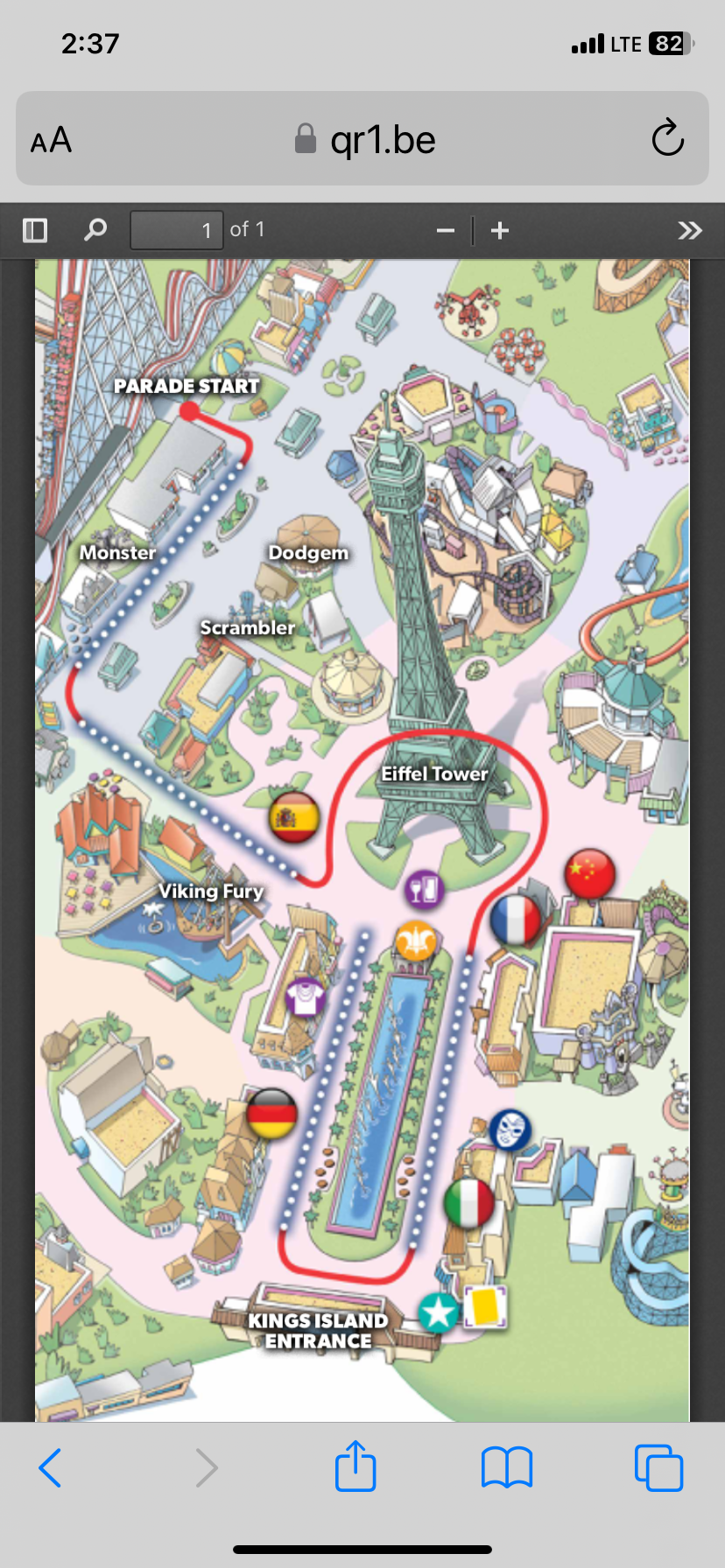
They’ve also posted this cool map showing where everything is. Looks like it’s gonna be a free-for-all!!
-
I know our family did. We went many times for it. It was a great early season event. Jim Stump was great in the SketchSchool. My youngest went over and over to draw each character.
-
Not sure why PEANUTS festival only ran one year. It was a copy of an ongoing event at Knotts, so the development cost was pretty low since a lot of the material already exists.