burlguy41005 Posted December 31, 2025 Posted December 31, 2025 On 12/17/2025 at 10:52 AM, Outdoor Man said: Couple thoughts: - in the image above- I like the Coney throwbacks in the park- but some of this seems misplaced since "Coney Mall" is somewhere else in the park. I thought they should dismantle one of the original Coney Island entrances from the old park (not sure what they'll be used as now) and reconstruct them at KI.... and build a replica of Moonlight Gardens as an indoor eating experience with a feel like the Grand Pavilion at CP. As for the themed area overhauls listed above... KI has too many "areas". International Street- one of the best environment entrances, but hardly "international" anymore Planet Snoopy- should be overhauled and incorporated into Camp Snoopy Camp Snoopy- great start (will it be expanded?) Action Zone- no cohesive story and has some aging rides in their last stages in prominent locations Octoberfest- basically a German-themed hall with American-Italian as well as Chinese fast food... and a swinging ship Adventure Port- two spanish themed rides... and arguably the best themed ride in the park Adventure Express Coney Mall- annoying pop music with a large scar in the back coming to it's 7th season Rivertown- Nice "rivertown'ish" feel with coasters that point in another direction Area 72- a good start but with a lot of concrete and nowhere to expand. Did I miss any? Its just an amusement park anymore...they lost the theming years ago...shame... Quote
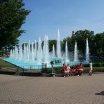
Losantiville Mining Co. Posted January 13 Posted January 13 This one will have a lot of pictures, so prepare your scrolling fingers. As much as it might make it harder to manage, I think a new, more substantial front gate sign would be nice. The 50th anniversary sign was really cool and I enjoyed how it stretched across the front of the fountains. The Haunt sign does more with its height in addition to having the flames and lighting effects. The Winterfest and Grand Carnivale signs are at the bottom of my list since they're just backlit panels, but I appreciate the decorations that the park puts around them. One aspect I'd love to see the park improve about it would be to cover the two stand poles. In my opinion, Dollywood's front gate sign is presented better overall when there are no decorations around it. It has a good festival modifier scheme and is more visible when people stand in front of it. Kings Island's sign still looks good, but after over 15 years, it might be time for a little change. Fun fact: KI's current logo might soon be the one it's had the longest (original 1972-1992, 20 years; PKI 1993-2006, 13 years between 2 logos; Cedar Fair/Six Flags 2007-2026, 19 years). Kings Island's front gate sign circa 2021 (Cincinnati Enquirer). The flagpoles are now gone — they didn't last long — but the rest of the view is largely the same. You can see how the park name floats a little too high above the flowers and could get lost in the wrong light. Cedar Point's front gate sign, without the lightbulbs (Cedar Point on Twitter); Cedar Point's marina gate entrance sign (https://bradysigns.com/work/cedar-point-marina-park-entrance/). The first sign certainly takes the cake for size, but the tagline would not be as good on a new sign for Kings Island. The second sign certainly follows Cedar Point's design language. It is more like the sign out in front of the gate, but what it lacks in height or background it makes up for in presence. Dollywood's front gate sign (https://pensacolamom.com/travel/top-10-reasons-to-plan-a-family-vacation-to-dollywood/). It has a good background with the Showstreet Palace Theater, but the height helps to draw eyes up more than the Kings Island sign does. Dollywood's front gate sign decorated for the I Will Always Love You Music Festival (https://diservations.com/dollywood-a-vip-tour/). You can see how simple the setup is with the decorative backing board and a sign in front of it. I would personally prefer something like this for the Spring/Summer festivals instead of a full replacement for Grand Carnivale and no special sign for the Food & Wine Festival. Grand Carnivale front gate sign at Kings Island (https://adventuremomblog.com/how-to-make-the-most-of-your-grand-carnivale-experience-at-kings-island/). Don't get me wrong, I like having these special signs, but making it easier to change out during the main season might help to bridge the gap between a dedicated sign for Grand Carnivale and nothing for Food & Wine and Star Spangled Nights. Kings Island's 50th Anniversary front gate sign (Exhibit 3 Fabrications on Facebook). I really like the verticality in the center of this sign and how it pairs with the horizontality coming from the gold ribbons on each side. You can clearly see where the fountain jets would fill either side of the "50" while the Quote
Orion-XL200 Posted January 13 Posted January 13 My problem with the logo where it is, is that if anyone is standing in front of it for a photo, it's hard to get a photo of it without including the people. It's also hard to see when anyone is standing in front of it, as it's too low (so taking a group photo in front of the fountain/sign, you get the fountain but not the sign). 1 Quote
IndyGuy4KI Posted January 14 Posted January 14 I am so happy the flag poles are no longer there behind the sign. 5 Quote
RollerColt Posted January 14 Posted January 14 29 minutes ago, IndyGuy4KI said: I am so happy the flag poles are no longer there behind the sign. Same! They make more sense being out before the entrance gates. 2 Quote
Losantiville Mining Co. Posted January 15 Posted January 15 The flag poles could probably look a lot better out in front of the turnstiles rather than bringing them back to "block" the view of the Eiffel Tower. I don't think KI necessarily needs to do what Dollywood and Dorney Park have with a secondary park sign a little further away from the gate, but it could be fun to have a Kings Island sign made out of foliage somewhere else in the park. The 50th anniversary sign is probably one of my favorites because of its overall shaping and how the ribbons span outward. If designing a new sign were up to me, I think I would start by trying to keep it on flat ground unlike the first PKI sign (seen below) and Kings Dominion's current sign. So far my guidelines are: overall shape should compliment the Eiffel Tower and draw eyes up to it needs to be able to be modified for seasonal festivals and removable for Fall and Winter events must say "Kings Island" spaces for foliage should be included in the design Paramount's Kings Island sign circa 1993 (CoasterAce on YouTube). As one of the first (if not the first) front gate signs at Kings Island, I think this iteration did exactly what it needed to do. It certainly fits in better with all of the mature trees lining International Street, far more than it would with the current trees in their still-smaller forms. I think the reason why this setup works better at Kings Dominion than it did at Kings Island is because KD has more trees along the front of their fountain that help to build up to the berm. 2006 Paramount's Kings Island sign (Reddit). This sign solved the issue of how much the berm blocked the view of the fountains, but is a little too low for my liking. I definitely appreciate how much the current setup both allows for guests to sit in front of the sign while also raising the planter bed up away from curb-level. The fountains being set to barely on doesn't help the view, but you can see where the shape of the sign compliments the Eiffel Tower rather than being a flat line below it. If I could find a photo of this sign from Fearfest, I'd also include it to show the decorations; however, if I recall correctly the decorations were really just placed around the planter rather than anything special being done with the sign. Paramount's Carowinds front gate sign some time after 2000 (https://www.screammachine.net/parkinfo.php?parkcode=PMCS); the same sign in 2012 ("Carowinds Classic Footage - 2012" by XtremeCoasters Network on YouTube). This sign accomplishes a lot of good things while remaining incredibly simple. It's one of my favorite park signs for a few reasons. It's big and was prominently featured as the vista point at the end of the path from the park entrance, something Carowinds now fills with a giant empty stage; the sign supports are designed rather than being simply functional, especially with the three bars behind the Paramount logo; and the foliage behind it both frames the sign while also allowing it to stand out. I have a feeling that this sign and planter were removed in 2017 to make way for an expanded stage (possibly to coincide with Winterfest), which is a shame. The current Celebration Plaza area is very disconnected design-wise and there is no longer a direct vista to be seen from the main entrance to the park. After the Paramount logo was removed from the sign it did lose some of the height that made up its good shaping. I don't know that making the Kings Island sign any wider/taller would help its current predicament, but this iteration of the Carowinds sign might provide inspiration in other ways. Paramount's SCarowinds front gate sign (https://www.charlottenc.gov/CS-Prep/City-News/Experinece-at-SCarowinds). You can see here how it was decorated for the first years of SCarowinds, likely sometime around 2001-2003 since neither the old Emporium building nor the Borg Assimilator are visible behind the trees. The decorations are simple and plentiful but don't distract from the sign itself. They also add a third layer with the sign and the trees behind it. I haven't been able to find any photos of it from Paramount's Carowinds 2005 iteration of Winterfest, but this specific photo of the SCarowinds decorations looks so good. The Halloween Haunt and Tricks & Treats decorations over the last few years have strayed away from the "classic frights" genre seen below, but at least the current Haunt sign is custom-made with special effects included. 1 Quote
Imperial79 Posted January 22 Author Posted January 22 I would love to see them bring back the Kings Island greenery sign out front somewhere or in the park, I think the best spot would be here, while guests are walking up to the park at the entrance plaza, but on the other side, since there are trees where it used to be today. First picture is where it used to be and second is where the new Kings Island greenery sign can go in yellow. 1 Quote
Orion-XL200 Posted January 22 Posted January 22 I agree but I think it could be cooler in front of the circle where the big Christmas tree usually is because they force guests enter security often to one side or the other...if they could utilize both sides that'd be great and the greenery could be seen in the middle. Whereas, if it were circled, people entering from the south side of the parking lot, may not see it. Quote
Losantiville Mining Co. Posted January 24 Posted January 24 I realize some of these photos are posting much larger than intended and I don't know how to shrink them so please bear with me! Kings Dominion still has theirs, although it's been sized down to that little spot between the trees on each side and uses the current logo. It's still big enough for a family photo, though. That park has a much better entrance plaza as well because of how centered it is compared to Kings Island's entrance plaza with how it feels like the entire left side of KI's entrance plaza is cut off from the rest of it. If there is ever a big front gate renovation then I hope that can be resolved with a little bridge that goes across the creek and through the trees (losing those trees is also my biggest issue with the idea of a front gate coaster). The area circled in yellow might not work as well because of the shaping of the hill right there and the visibility as Orion-XL200 pointed out, but could be good if they mirrored it on the other side like Kings Dominion did with theirs. I'd be more open to a sign going in that center circle if they could do it better than Cedar Point and Carowinds did theirs. The one at Worlds of Fun looks much better, although theirs also has the hot air balloon tying back into their park theme — something that Kings Island might not be able to do as well without putting a mini Eiffel Tower up. As for International Street proper, I think an easy way to help it (besides a new front entrance sign and/or more vintage fixtures like it originally had) would be to add two relatively small planters on either side of the giant plaza once you get into the gate. There would still be enough space for guests, parades, and emergency/maintenance vehicles; there would just also be something that breaks up that vast expanse of pavers. It could also serve as a little bench for a few people during the fireworks shows. Quote
Orion-XL200 Posted January 25 Posted January 25 I know we have talked on here how we all want the front gate area to be completely changed....I'd be fine if they'd just upgrade and make the entry plaza more cohesive. I hate when I park in the south lot and can't use the security on the south side of the plaza...it's a pain in the @$$ lol. It's also a pain when they only staff the south side and I park in the north. Staff both or renovate to make the center area the access more guest friendly. 1 Quote
SmartCat7162 Posted January 26 Posted January 26 It appears that they are slowing updating the retail spaces in the front of the park. Hopefully this trend will continue because they are a lot nicer than before. 2 Quote

Recommended Posts
Join the conversation
You can post now and register later. If you have an account, sign in now to post with your account.
Note: Your post will require moderator approval before it will be visible.