
Leaderboard


Popular Content
Showing content with the highest reputation on 06/24/2025 in all areas
-
So THATS why monster is closed!2 points
-
Bankruptcy will likely be the answer to get out of the monster debt they are in.2 points
-
That's when those of us who are honest with our purchases make a scene loudly announcing the thievery taking place. If no one will hold them accountable...well...it takes a village... People have become to soft and complacent with letting others take advantage of the system. Who care's if it's a drink refill, the point is...it's still theft of something that wasn't paid for. Make an example of them.2 points
-
I fear darker days are to come. They will probably not reach the margins that they promised to investors, so they may try to cut more. You think there isn't that much left to cut, but they can cut a whole lot more if they tried. I would not be surprised if they tried to remove another layer of management from the park.1 point
-
One pretty interesting update I saw recently is that the https://www.sixflags.com/ landing page now has the new corporate logo in the top left corner. It replaced the pre-merger Six Flags corporate logo as the company continues to develop its new websites and mobile apps. The rest of the website is still in transition and looks like a reverse-Frankenstein's Monster with some pages reflecting the old while others reflect the new. It doesn't look very good, but I'm curious what it'll look like when the new websites are launched. It'll also be interesting to see if the Legacy Cedar Fair parks have their websites and mobile apps updated as well. A side note: I don't really like that the corporate logo always has the "Entertainment Corporation" tagline at the bottom. I already thought it looked bad, but the tagline makes it feel like they're dedicated to money and shareholders, not fun (and we know how that's working out). Cedar Fair didn't have it as part of their logo. It'd be nice to see it at least removed for the guest-facing websites.1 point
-
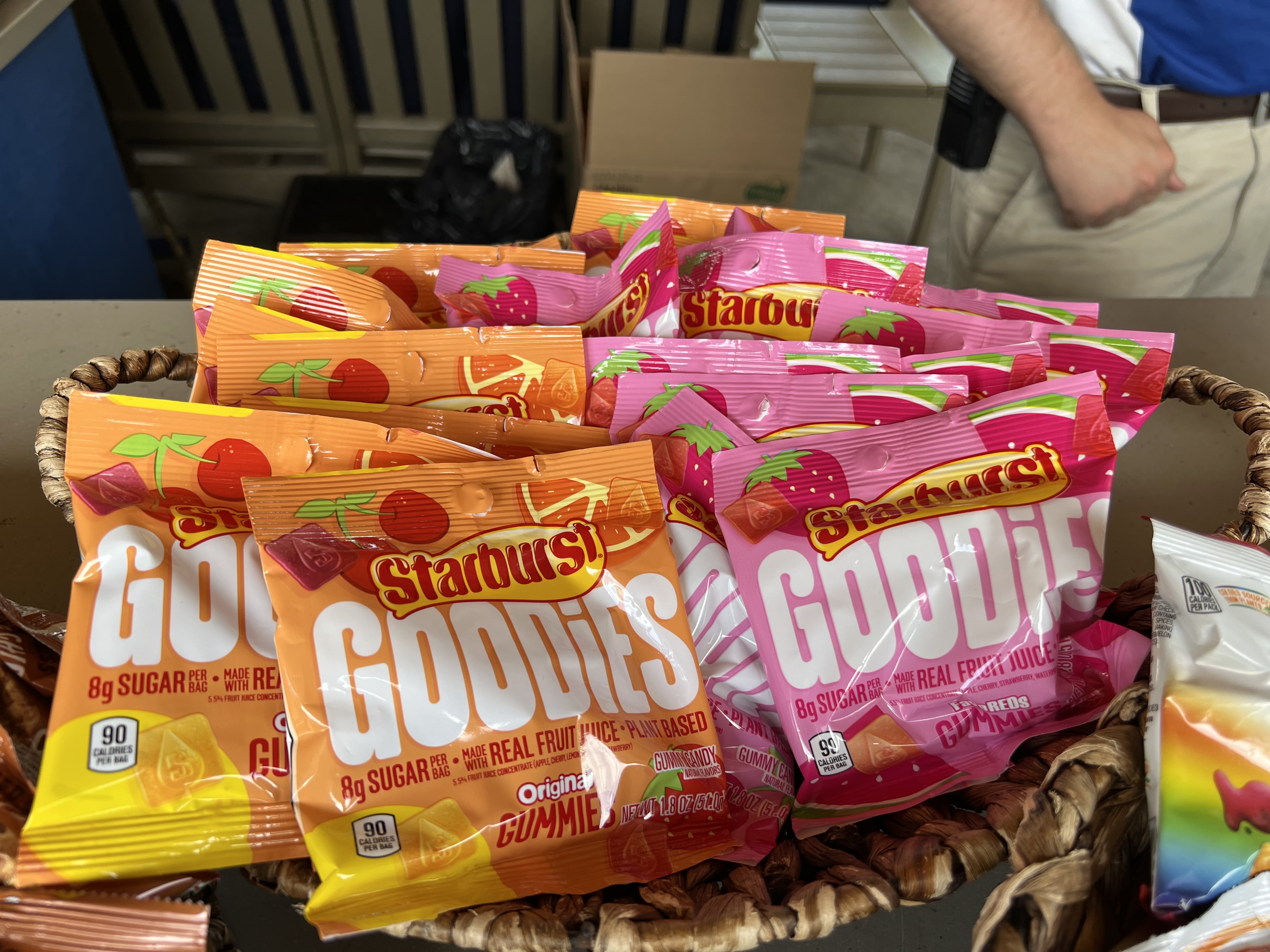
New snack option in the lounge.
 1 point
 -
…give it different coat of paint under the track. This was just a concept that @DustinTheNow made a while back that illustrates what I mean: I really like how Fury had the lime green and Valravn had that silver- it felt like a true next step in how coasters were supposed to be painted, but we unfortunately didn’t get that with Orion. Maybe when it’s due for a repaint in 10+ years
1 point
-
It'd be nice to see this with the blue track and white/gray supports! I'd love for Kings Island to get a tri-tone paint scheme on one of their coasters, but I don't have faith that Six Flags would see it as a good expense. KI has a "high market penetration" so I can't see the company wanting to put much fun extra investment like that into the park.1 point
-
Let me guess, was it green track? lol (iykyk)1 point
-
I fear that the darkest days are upon us. I'm usually an optimist but all I feel I've read lately from the chain has been about cutting this and getting rid of that. It's like a game of Fruit Ninja but with the chain as a whole. Mega-chains are, IMO, never a good idea. It diminishes quality and seems to hurt the parks as a whole as they lose their identity and the people behind them who make them what they are. This feels like they could SFWOA/GL the entire park system if they aren't careful. Might sound a bit dramatic, but I really don't have much faith in the SF model and so far they haven't exactly left a good impression thus far. I hope the growing pains aren't here to last and I hope I'm wrong.1 point


This leaderboard is set to New York/GMT-04:00