



Leaderboard
-
Losantiville Mining Co.
Members4Points1,628Posts -

beastfan11
Members2Points2,095Posts -
.png.d6d23ff1c3467b81a02dd2f7ecefcb39.png)
Hawaiian Coasters 325
Members2Points4,284Posts -
robintodd
Members2Points925Posts


Popular Content
Showing content with the highest reputation on 04/03/2026 in Posts
-
2 pointsHopefully to a new better soundtrack. I swear if the jazz returns for a 5th time....2 points
-
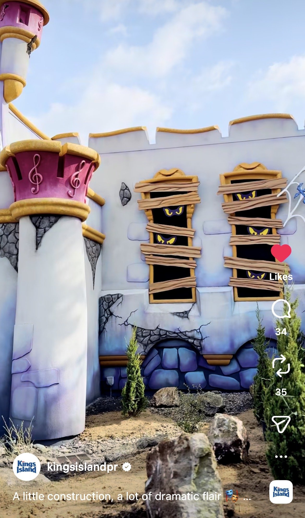
I think it will definitely look better if/when the foliage grows in. Removing the eyes does make the windows look a little plain, but the issues with the parapet could be solved by adding a roof trim like the original had. It could either be flat (like the image below) or still be curved to go with the rest of the current structure. The rubble and missing stucco details are fine IMO. They add to the rundown look the ride is going for. (I think this image was made by either BryanJay or Hawaiian Coasters 325, sorry if I got it wrong though!) One thing that keeps getting me is all of the people who are baffled to see that the ride will have a very cartoon-y art style. I completely understand why they wanted a more refined look, but this should not be a shock to anyone who's seen the singular piece of promotional art that's been used for the new ride since August.2 points
-
2 points2 weeks till passholder preview day. Action going on at the monster, zephyr has it's canapy on and the scrambler has been running most of the morning!2 points
-
There’s something special about a milestone season, and Hersheypark is leaning into it in a big way. Details: https://themeparksbydon.com/hersheypark-120th-season-spring-weekends/1 point
-
It is jazz....but it's the Phineas and Ferb theme song.1 point
-
Of course they cut down the trees around the entrance This chain is incapable of building anything new and preserving the trees. KI continues to have less trees every season.1 point
-
Double posting to mention that the Royal Fountain has started its testing!1 point
-
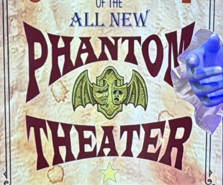
Thought the same. The music notes gave me Magic Kingdom Birthday Cake Castle vibes at first. Eyes looked a bit cartoony, too. But cleaning those up, along side some of the more castle-y bits made it look a bit plain. The more I’ve looked at it, the more it’s grown on me. Not that I hated it or anything, but I have a feeling it will work well with the art design of the ride itself, which we haven’t really seen much of. As far as the sign, I’d imagine it would be the official logo: But personally, I feel something like this would look better color-wise:


 1 point
 -
Did they announce this anywhere? Edit: Nevermind I found it. That’s cool.1 point
-
Agree - its WAY too much going on and introduces a conflict into the narrative based on what we've seen so far. The interior looks "new" - just spooky but not abandoned and rediscovered. I seemed like the story was more "this is a phantom theatre that brings the spirit world's best entertainment to the living - enjoy the newest production" not "we have discovered a long-abandoned theatre and have 'disturbed the spirits' with our need to 'see the theatre" Now it's a comically distressed looking exterior that doesn't really look authentically distressed and a new looking interior - maybe the show scene will tie it all togther, but as of now REALLY not liking the exterior. Should've not done the crumbling plater and boarded up windows. WAY too literal and not in a good way1 point
-
I was thinking myself that it was giving off Scooby-Doo vibes! Honestly its starting to look more Scooby-Doo then when it ORIGINALLY was Scooby-Doo. 😅 (Note I'm a BIG Scooby-Doo fan!)1 point
-
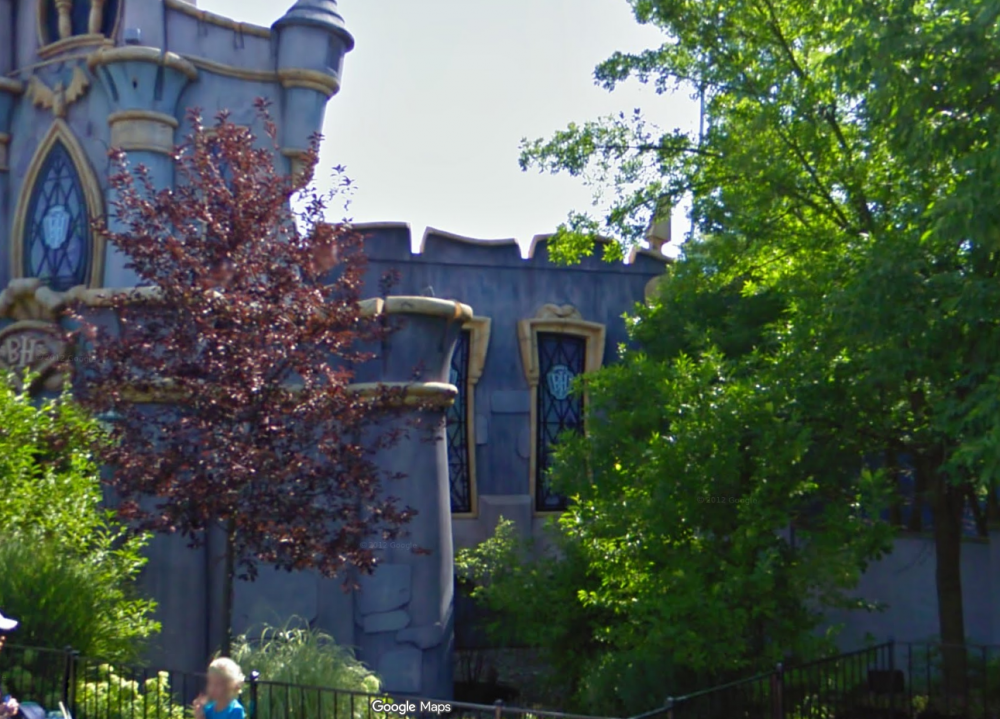
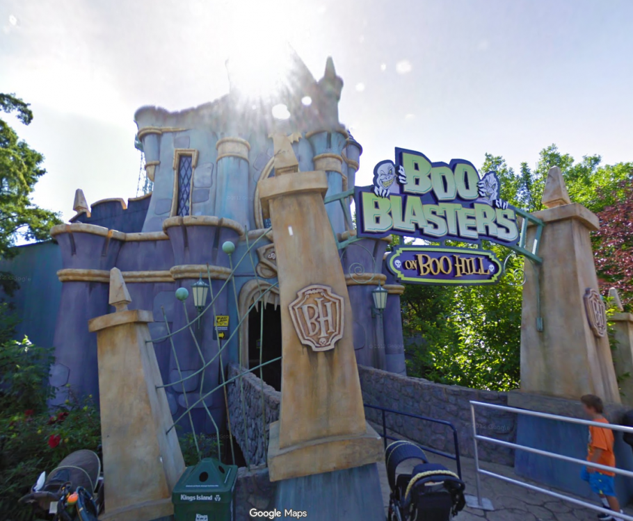
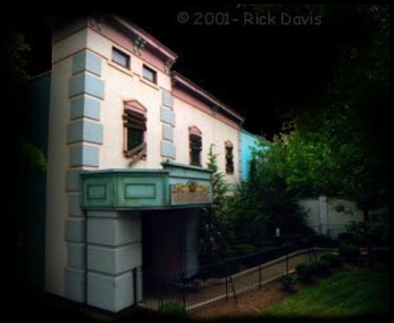
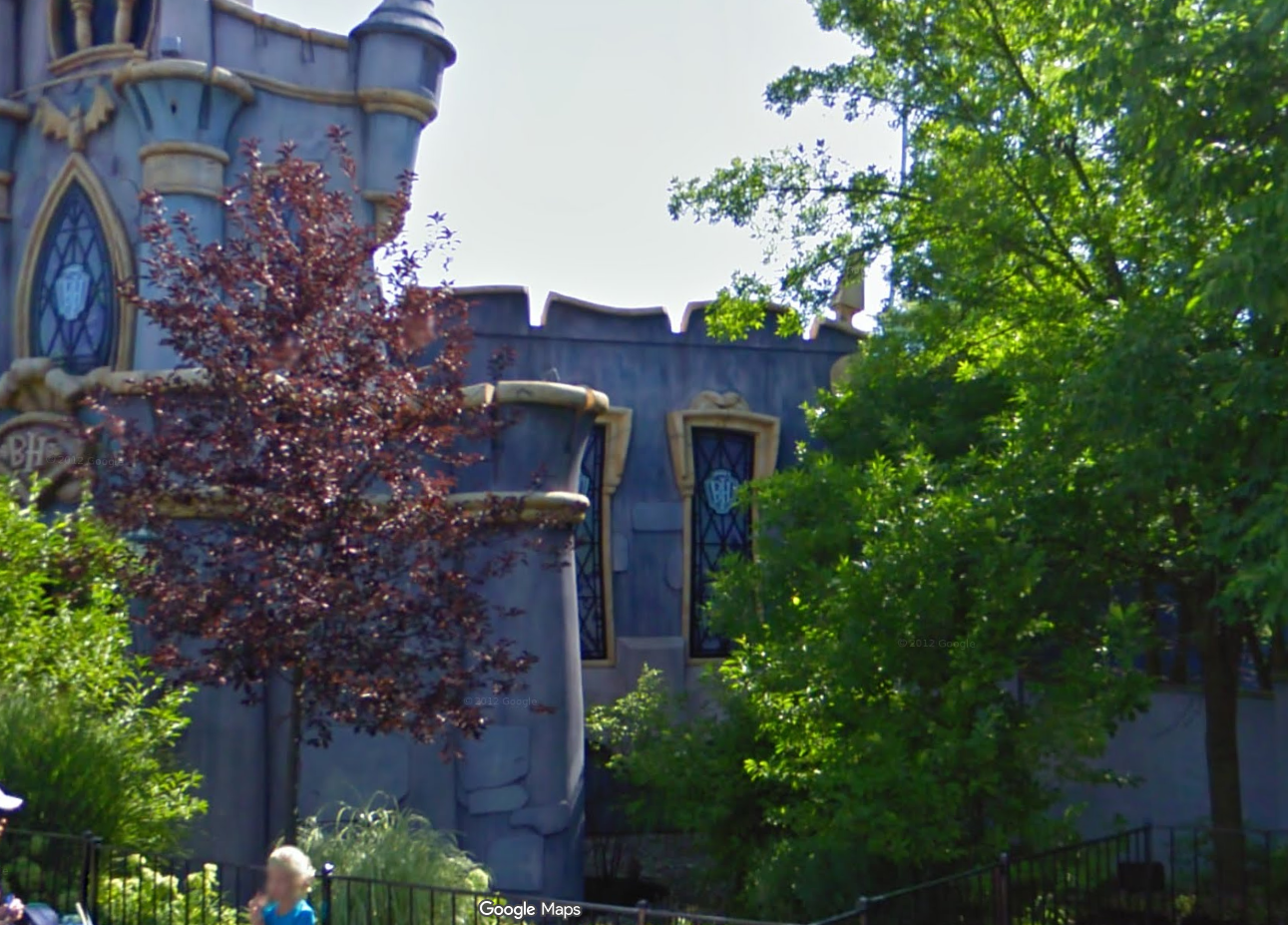
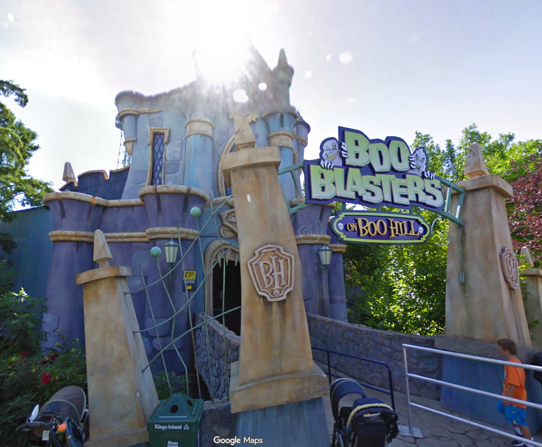
I like the new color scheme more than I thought I would. Would it have been nice to see bigger changes to the castle? Definitely, but I still think it's a lot better than what was there for 15 years after nothing substantial was changed for Boo Blasters. The view of the right side windows was more hidden during its time as Boo Blasters. It's possible that once the new foliage grows in it will be covered more. The eyes give me Scooby-Doo vibes more than anything, which is a nice little callback if anything. The center-left pillar of the entrance Finally, a look back at the original facade. I don't think they would have ever sprung for something this realistic when the new ride is already so much more cartoon-y than the original. That's fine with me. (Photo: Rick Davis via DAFE)
 1 point
 -
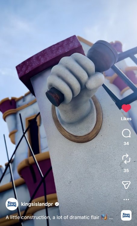
Short video teasing the “new” facade has found its way to Instagram. Check it out! The disembodied flashlight hands are… a choice. But I’m impressed with the amount of work that went into this. Still think it looks like a castle, though. Looks good!

 1 point

.thumb.png.8e7f1090cc8ce08ec0aa4a9c54cc20be.png)




This leaderboard is set to New York/GMT-04:00