beastfan11
-
Posts
2,062 -
Joined
-
Last visited
-
Days Won
50
1 Follower

beastfan11's Achievements
")
KIC Double Platinum Member (9/13)
3.7k
Reputation
-
Gotta say, they‘re putting the work into getting it right. Appreciate the dedication. Kudos.
-
I felt a great disturbance in the Son of Beast revival fanboy movement, as if millions of voices suddenly cried out in terror and were suddenly silenced.
- 44 replies
-
- 13
-

-

-
Six Flags and Cedar Fair Merge
beastfan11 replied to IndyGuy4KI's topic in Kings Island Central Newsroom
To be fair, they’ve been able to make things work with Universal. Hagrid’s had a rough start, but Velocaciaster seems to be reliable. Certainly not to the same tune as their other installs within the chain, though. Not sure what the issues are. It is a shame because I’d love to see them do something at KI one day. -
Funny thing about the music. Got three rides in today. First time I could hear the score clearly through the queue and ride. Definitely seems like it’s something they’re working on. Not perfect, but it’s getting there. Appreciate the work that’s going into it, still. Side note, the show looked great. Everything worked perfectly sans the screen in the furnace. Which is a bizarre. Seemingly an easy fix. Not sure what’s up there.
-
Universal Kid’s Resort in Texas
beastfan11 replied to jzarley's topic in Other Amusement Parks & Industry News
Universal Kid’s Resort First Impressions The reviews are in and… even with a children’s coaster themed to infamous comedian Bill Cosby, Kings Island apparently still had the better Nick kids area. -
Gargoyles eyes have lit up on my rides, and the inverted bust is an “analog” effect/illusion that doesn’t have the option of not working, unless it’s unlit or you have vision problems.
-
Some really solid footage of The Smurf’s Enchanted Voyage from a Reddit post. Worty checking out for those interested.
-
Feeling jealous of KD. Check this out. Beautiful.

-
Ah, love the International Street refurb, minus the tree and fountain situations. Wish we could’ve had both. From one of my favorite zen, solo trips way back in 2018. Sure do miss this view. Just feels a bit open and empty still. Miss the coziness.
-
Kings Island 2026 Food Reviews and Discussion
beastfan11 replied to IndyGuy4KI's topic in Kings Island
Has the Jersey Dog special at the Brewhouse yesterday. Definitely worth a try. Really enjoyed it. Brought me back to the days of the footlong cheese coneys they used to have at the stand where Mystic Timbers’ entrance is now. Good times. -
Just had a solid ride with the wife and kiddo. Only thing not working was the boiler screen. Seems like the issues are intermittent and probably vary from ride to ride. Really love this one.
-
Ir anyone is disappointed by the fact that there’s not going to be a major coaster opening at the park next year, that’s on you. Pretty obvious.
-
Definitely felt it, also experienced the “smellivision” effect here too.
-
Our boy’s finger is all good.
-
Kings Island 2026 Food Reviews and Discussion
beastfan11 replied to IndyGuy4KI's topic in Kings Island
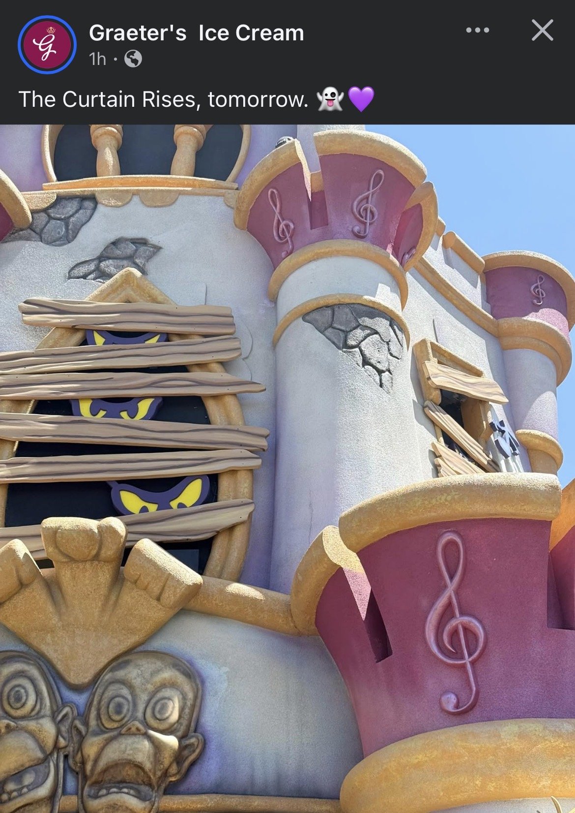
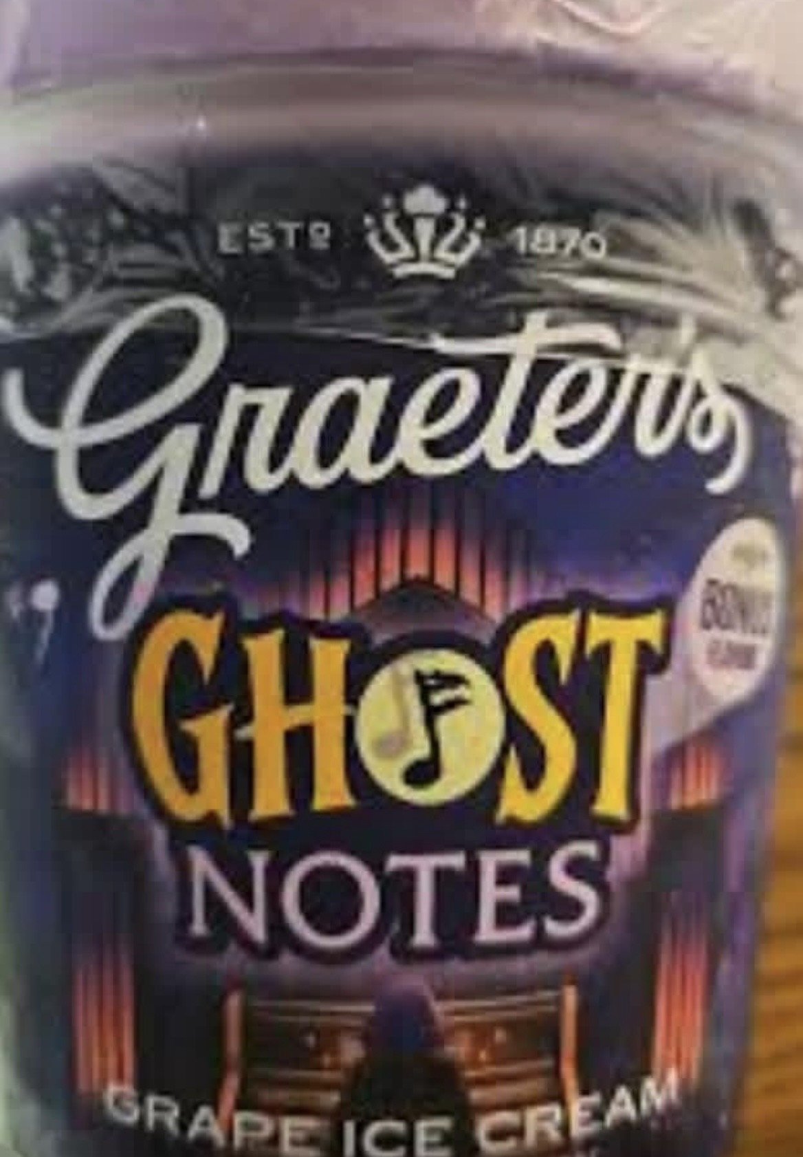
Looks like Graeter’s is rolling out a new grape ice cream flavor, “Ghost Notes,” inspired by Phantom Theater: Opening Nightmare. Wonder if we’ll see it at the park?